
Topic: What is an example of an ad that uses visual elements to its advantage? What are those elements and how are they used?
Introducing Rhode Skin:
Hailey Bieber’s Rhode Skin is a billion-dollar skincare company that focuses on “clean-girl aesthetic” with their vegan, cruelty-free, and dermatologist-developed skincare, makeup, and merchandise products. Rhode Skin has really evolved the visual and “senses” marketing game, with many brands following their footsteps in creating visually appealing, entertaining, and engaging marketing materials throughout many campaigns.
Glazing Milk Toner Campaign:
Rhode Skin used a lot of visual elements when launching their Glazing Milk Toner, such as many neutral white and grey tones to show the clean elements, showing it’s a simple and clean product for the skin. But the main visual component that caught most people’s attention with this campaign is her in a milk bath or dumping an enlarged version of her product filled with milk inside. A lot of the time, milk is associated with soothing down spice when eating spicy food, using the visual element of the milk aligned with what the product is supposed to do, which is soothe irritated skin and reduce redness, so this campaign was one, visually appealing and one of the first of its kind, using food visually in marketing, and two, the visuals aligned with the purpose of the product.
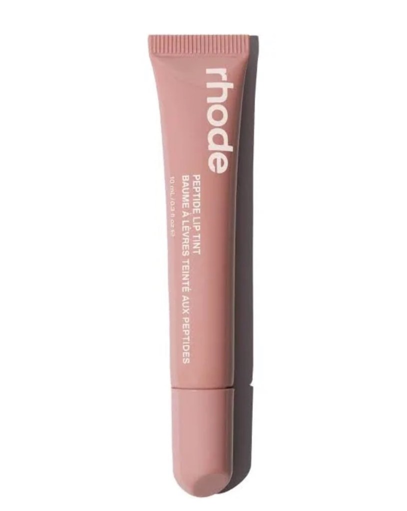
Tinted Lip Treatment Campaign:
When Rhode began to launch their tinted lip treatments, they used a lot of visuals with colors to promote that they were launching tinted lip products. This was big and had a lot of hype around it at the time because Rhode was mainly a skincare brand, so the majority of the branding and visuals were all neutral to connect with that clean skincare aesthetic. When Rhode posted a pop of color to their Instagram feed, that’s when you knew there was going to be an exciting new drop, which is one way Rhode utilized visuals, through color.
Rhode utilizes a lot of food for their visuals, so when launching their tinted lip treatments she connected the colors with food that matched the color of the lip treatments, giving the viewer a fun and different branded element to connect back with the product. I believe this worked because marketing like this has been done much in the past, and it is very aesthetically appealing to look at and very creative. From there, a lot of Rhode customers have gotten really creative with the products, specifically the lip treatments, posting their own aesthetic photos of their products that they purchased with everyday items like food, creating that sort of “word of mouth.”
Rhode continued this same approach with their scented-tinted lip-products, connecting them with food such as their beige color with crème brûlée, their brown with espresso, and their magenta with raspberry, allowing consumers to view it and then use their senses to visualize and think about the product and what way it would smell, making them more intrigued in purchasing it.
Overview:
Overall, Rhode uses a lot of visual content to their advantage when advertising, with colors and food imagery, which I believe works because visual aesthetics make a brand feel more trendy and premium, which attracts more people to the brand, later making a purchase.
ChatGPT Prompt:
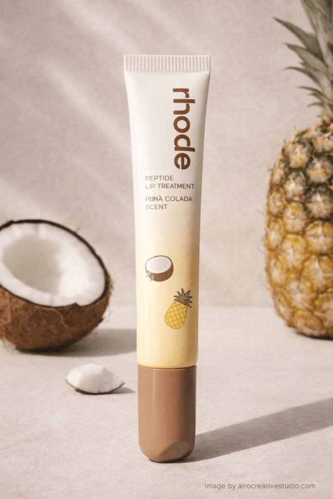
“Create a high-end, aesthetic marketing image inspired by Rhode Skin’s visual branding. Make a mockup for a new Rhode Skincare Peptide Lip Treatment that is Pina Colada scented. Show a minimalistic skincare scene with neutral tones and make the actual packaging of the lip treatment white, beige, brown and light yellow tones, and add some minimal coconuts and pineapple stickers on to it. Include subtle food-inspired elements like coconut and pineapple visuals. Make the style clean, luxury, and social-media-ready with a modern, premium aesthetic. Add a small text in the corner that says ‘image by alrocreativestudio.com’ Attached is an example of the actual Rhode Peptide Treatment Packaging shape.”
ChatGPT Generated Image:

Leave a comment